
 Share
Share
Making Brevo Automation
Here is a costly reality for online brands: 70.22% of all online shopping carts are abandoned before purchase, according to Baymard Institute’s aggregate of 50 independent studies (updated September 2025). Cart abandonment costs eCommerce businesses an estimated $4 trillion globally every year.
And the fix rarely starts at checkout. It starts on the product page. While abandoned cart email campaigns can help recover customers who leave, preventing unnecessary hesitation before the shopper abandons the purchase is even better.
According to the Baymard Institute’s own usability research, 18% of users abandon carts due to UX issues that arise on the product page before they ever reach checkout. A further 53% of US online shoppers say they will abandon a purchase if they cannot find a quick answer to a question. (Source: Doofinder)
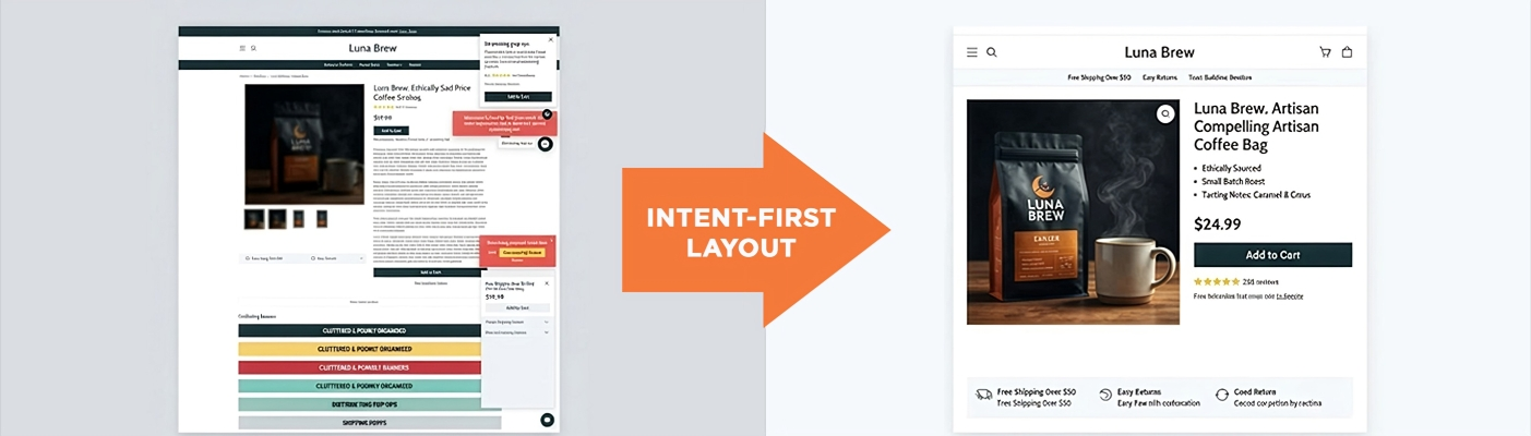
Shoppers rarely leave because your product isn’t good enough. They leave because your page forces them to hunt for basic information. Fixing this starts with one core concept: designing your product page layout around buyer intent, giving customers exactly what they need to know at exactly the moment they need to know it. This is a core part of creating a better eCommerce user experience, where every page element reduces friction instead of creating more questions.
What Is a Shopify Product Detail Page?
A Product Detail Page (PDP), also called a product page, is the individual page within your Shopify store where a single product is presented for sale. It is the page where the actual buying decision is made.
Unlike your homepage or collection pages which are designed to attract and filter interest a PDP has one job: convert a curious visitor into a confident buyer. Every element on the page, from the image gallery to the CTA button to the shipping disclaimer, either supports that goal or creates friction against it.
For most Shopify stores, the PDP is the highest-traffic, highest-stakes page on the site. Yet it is also the page where design decisions are most often made by copying a competitor template rather than thinking through what a buyer actually needs.
What Does ‘User Intent’ Actually Mean in eCommerce?
In simple terms, user intent is the specific goal, question, or doubt a customer has when they land on your product page. Every visitor arrives at a different stage of their buying decision, carrying a mental checklist they need you to clear before they hand over their credit card.
eCommerce user intent generally breaks down into three core mindset stages:
Stage 1: Informational Intent (“What is this?”)
The buyer wants immediate clarity. They need to know what the product does, what it looks like in real life, and its core benefit all within the first three seconds of landing on the page. At this stage, a blurry image or a cryptic product code will cost you the sale before you’ve started.
Example: A shopper who clicks an Instagram ad for a skincare serum arrives here. They want to see the product clearly, understand its core benefit (‘brightens skin in 14 days’), and see the price. If your hero area answers those questions, they stay. If it doesn’t, they bounce.
Stage 2: Evaluative Intent (“Is this right for me?”)
The buyer is actively comparing options. They are looking for specifications, sizing guides, material lists, compatibility information, or real-world use cases. This is where your page needs to answer very specific questions that differ by product category.
Example: For an apparel brand, they want to know if the size medium fits a 175cm frame. For a Singapore electronics retailer, they want to know if the product supports 240V Singapore power standards. If your layout buries these details behind a generic ‘read more’ link, evaluative buyers leave to find a competitor who answers them directly.
Stage 3: Transactional Intent (“How do I buy with confidence?”)
The buyer wants to purchase, but anxiety stalls them. They are looking for shipping times, return policies, payment options (like Buy Now, Pay Later), and social proof from real customers.
Why Matching Intent Matters for Conversions?
When a Shopify layout mirrors this natural sequence of questions, buying feels effortless. When it doesn’t- say, putting shipping policies above product visuals or hiding sizing guides behind obscure navigation- friction wins, and shoppers leave.
Structuring a high-converting Product Detail Page (PDP) isn’t about guesswork; it is about delivering the right answer at the exact moment the buyer asks it. Product page structure is only one part of the wider strategy needed to increase Shopify store conversions, but it is often where the biggest purchase barriers can be removed.
Lifting a Shopify store’s conversion rate from 1.4% (average) to just 1.9% through targeted product page improvements is worth $1.78 million in additional annual revenue for a store generating $5M per year. (Source: AppMaker, 2026)
Why Do Most Shopify Product Pages Lose Sales?
Product page optimisation should also be part of a broader effort to optimise your Shopify store across user experience, speed, navigation, and conversion paths. These are the most common conversion-killing patterns we see when auditing Shopify stores:
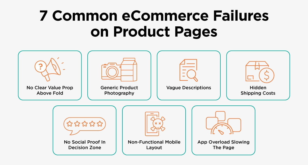
- No clear value proposition above the fold: The first screen doesn’t answer ‘What is this and why should I want it?’ Visitors leave before scrolling.
- Generic product photography: Studio shots that could belong to any brand, with no lifestyle context or scale reference. Shoppers can’t visualise owning the product.
- Vague, generic product descriptions: Copy that describes what the product is (‘a premium quality bag’) rather than what it does for the buyer (‘holds a 15-inch laptop, two notebooks, and a full day’s worth of charging cables without looking stuffed’).
- Surprise costs appearing only at checkout: 39% of cart abandonments are caused specifically by unexpected extra costs at checkout. (Stripe, 2026) Transparency on the product page prevents this.
- No social proof in the decision zone: Review ratings buried at the bottom of the page, away from the point where buyers hesitate over the CTA button.
- Broken mobile experience: Non-swipeable image galleries, buttons too small to tap, text that requires zooming all leading to the 75-85% mobile cart abandonment rate.
- Too many third-party apps: Every additional app adds JavaScript weight. A product page that loads in 4 seconds converts at roughly half the rate of one that loads in 2 seconds.
Essential Steps to Structure Your Shopify Product Page Layout
Matching user intent requires a deliberate, section-by-section layout. By organising your product detail page into logical zones, you guide shoppers from initial curiosity to confident checkout without letting friction get in the way.
Here is how to map out every section of your Shopify page to answer critical buyer questions as they arise.
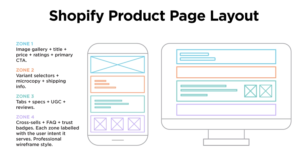
Step 1: Win the First 3 Seconds (Above the Fold)
Users do not read web pages top-to-bottom. They scan them in an F-pattern to answer three immediate questions: What is this? Is it right for me? What does it cost? Keep everything essential above the scroll line on desktop and within the immediate viewport on mobile:
High-Impact Media Gallery
Place clear, high-resolution product images on the left. Include lifestyle shots alongside clean studio photographs. If your product moves, works in a specific way, or has a feature that’s hard to convey in a still image, add a 5-second auto-playing video loop. Real-world context transforms digital browsing into a near-physical product evaluation.
Clear, Searchable Product Title
Skip quirky internal product codes. Use the actual name real humans search for. If you sell ‘The Metropolis Everyday Tote in Sage’, your H1 should be ‘Metropolis Everyday Tote Sage Green, Vegan Leather, 20L Capacity’. It’s longer, but it answers both the visual question and the specification question simultaneously.
Price & Payment Transparency
Display the full price clearly and immediately. If you offer installment options like Shop Pay, GrabPay, or Hoolah for Singapore customers, show the split price (‘4 payments of $24.75’) directly below the total. This doesn’t hide the price; it reframes the psychological impact of it.
Star Ratings with Review Count Above the Fold
Anchor trust immediately. A simple ‘4.8 ★ (124 reviews)’ link placed directly under the product title does more conversion work than three paragraphs of brand copy. It tells the buyer that real people have bought and liked this product before they’ve read a single word of your description.
Punchy Benefit Bullets
Write 3–4 short bullets highlighting primary buyer benefits. This is not the place for technical specifications. ‘Hold a full day’s essentials without the strap cutting into your shoulder’ beats ‘600D polyester outer, 35cm x 25cm x 12cm’ above the fold. Save the detailed specs for the evaluation zone below.
Step 2: Eliminate Friction at the Point of Decision
Between the product title and the Add to Cart button lies the critical zone where buyers hesitate. Clear design choices eliminate that friction. In many cases, achieving the right PDP experience requires more than installing a new app; learning how to customise a Shopify website around your customers’ buying behaviour can help create a more intentional conversion journey.
Make Variant Selectors Impossible to Get Wrong
Ditch basic dropdown menus for apparel or visual goods. Use colour swatches and visual size pills instead. When a customer selects a variant, update the hero image automatically so they know exactly what they are buying.
Explicit Microcopy Directly Below the CTA
Vagueness kills conversions at the moment of decision. Beyond button placement, the wording itself matters, and strong CTA copywriting can help make the next action feel clearer and more compelling. Add three specific pieces of microcopy directly under your ‘Add to Cart’ button:
- “In stock ships within 24 hours”
- “Free shipping on orders over SGD $80”
- “30-day returns, no questions asked”
These are not decorative. They address the three most common transactional anxieties: delivery time, shipping cost, and risk of a wrong purchase at the precise moment a shopper considers committing.
Step 3: Deep-Dive for Evaluative Intent (Below the Fold)
Once shoppers pass the initial visual check, their intent shifts from ‘do I want this?’ to ‘should I buy this specific one?’. They want proof, granular detail, and reassurance from people who’ve already bought.
Use Collapsible Accordion Tabs for Detailed Specifications
Avoid the wall-of-text. Organise secondary information into expandable tabs that load the page clean but deliver depth on demand:
- Dimensions, Materials & Technical Specifications
- How to Use / Care Instructions
- Sizing Guide with actual measurements (not just S/M/L)
- Compatibility Information (for electronics, tech, or accessories)
- Shipping & Return Policy (full details)
Accordion tabs serve two audiences simultaneously: quick scanners who need the page to feel uncluttered, and meticulous evaluators who want to find the full specification table when they’re ready for it.
Show the Product in Context with Real Customer Content
Embed User-Generated Content (UGC), customer photos, and short video clips in a dedicated section below the main product details. Seeing real people, not models, using your product bridges the gap between digital browsing and real-world ownership. This content isn’t decoration; it’s social proof at the exact moment buyers are deciding whether to trust the product enough to purchase.
Step 4: Pre-empt Objections with an Intent-Focused FAQ
Generic FAQs like “When was your company founded?” belong on an About Us page. Your product page FAQ must answer real purchase blockers:
- “How does this size run? I’m between sizes and ordering online makes me nervous.”
- “What happens if this doesn’t fit? Can I exchange for a different size for free?”
- “Is this compatible with [specific device/model/system]?”
- “Can I use this for sensitive skin / young children / outdoor use?”
Structure these questions using schema markup (Shopify app plugins make this easy). This not only helps buyers decide faster but also helps search engines feature your product directly in Google’s Rich Snippets.
Mobile-First Layout for Shopify Product Pages
Designing mobile last is designing for failure. Mobile cart abandonment runs at 75–85% compared to 60–65% on desktop, and mobile accounts for the majority of Shopify store traffic in most industries. If your product page is designed desktop-first and then shrunk down, your mobile experience is a compressed version of your desktop experience not a purpose-built one.
Mobile cart abandonment rate: 75–85%. Desktop abandonment: 60–65%. Mobile accounts for approximately 60-65% of total Shopify store traffic. (Source: Growth Suite)
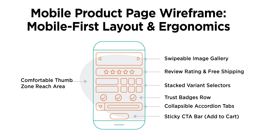
Mobile-Specific Layout Principles
Sticky CTA at the bottom: Keep the ‘Add to Cart’ button fixed at the bottom of the screen as mobile users scroll. The button must stay within thumb reach at all times. This single change consistently reduces mobile cart abandonment.
Swipeable image gallery: Replace click-to-advance image navigation with swipe functionality. Mobile shoppers expect this intuitively; a click-based gallery on mobile is a friction point that feels like a design error.
Stacked variant selectors: Don’t try to fit colour swatches side-by-side on a 375px screen. Stack them vertically, use larger swatch sizes, and ensure selected states are clearly visible with a border or checkmark.
Accordion tabs by default: What works as expandable tabs on desktop is mandatory on mobile. No mobile shopper will scroll through a 600-word wall of specifications; they’ll leave instead.
Font size minimum 16px: Any body text smaller than 16px triggers iOS Safari’s auto-zoom, which breaks your carefully designed layout. Set a 16px floor on all body copy.
Spacing between tap targets: Touch targets need at least 44x44px, with 8px of spacing between adjacent interactive elements. Buttons and links that sit too close together cause mis-taps and frustration.
Page Speed and Technical Performance
Page speed is not a technical nicety, it is a conversion variable. Beyond improving the shopping experience, learning how to optimise page speed for better SEO can also help product pages perform more effectively in organic search. Research consistently shows that every additional second of load time reduces eCommerce conversion rates by approximately 7%.
For Shopify stores, the biggest speed killers are almost always third-party app installations. Every app you install typically adds HTTP requests, JavaScript files, and CSS that load on every page whether or not that page uses the app’s functionality.
Speed Principles for Shopify PDPs
- Prioritise built-in Shopify theme capabilities over third-party apps wherever possible. A feature built in native Liquid adds zero overhead; a third-party app adds a full JavaScript bundle.
- Compress all product images to WebP format (30-40% smaller than PNG/JPG at equivalent quality). A typical Shopify product gallery goes from 3MB to under 800KB without any perceptible loss of quality.
- Implement lazy loading on below-the-fold images. The above-fold image loads immediately; everything else loads as the user scrolls toward it.
- Run a Google PageSpeed Insights check on your product page URLs, specifically not your homepage, which is usually better optimised. The ‘Opportunities’ and ‘Diagnostics’ sections will tell you exactly what to fix.
- Limit variant-selector apps: If your theme includes colour swatches natively, don’t install a third-party swatch app on top of it. Duplicate functionality doubles the overhead.
Social Proof, UGC, and Why Authentic Reviews Win
Social proof is not just a conversion tactic. In 2026, authentic customer reviews and user-generated content are some of the strongest signals available both for human buyers making purchase decisions and for AI search systems deciding which brands to recommend.
Research consistently shows that buyers trust the opinion of a stranger who has actually used the product far more than any brand-authored copy. A product page with 87 real customer reviews featuring photos converts at a meaningfully higher rate than an identical page with no reviews even if every word of the product description is technically superior.
Social Proof Placement Strategy
Above the fold: Aggregate star rating (e.g., 4.7 ★ based on 94 reviews) placed directly under the product title. This builds baseline trust before the buyer reads a single word of your copy.
Mid-page (evaluation zone): Individual customer reviews with verified purchase badges, specific ratings by attribute (fit, quality, delivery), and customer-submitted photos. This is where evaluating buyers look for validation from people who face the same doubts they’re carrying.
Q&A section: Real questions from real buyers, answered either by your team or by other verified purchasers. This is also the most direct source for your PDP FAQ section.
Authentic Reviews as an AI Search Signal
The principle is simple: authentic, specific reviews on trusted platforms (Google Business Profile, Trustpilot, Shopify Reviews) provide the kind of third-party validation that AI search systems treat as independent confirmation of your brand’s credibility. A small number of genuine, detailed customer reviews that mention specific product benefits carry more weight in AI-powered recommendations than dozens of generic positive mentions.
For Singapore Shopify stores: actively build reviews on Google Business Profile, Trustpilot, and within your Shopify product pages. Prioritise review quality (specific, detailed, with photos) over review quantity. Negative reviews left unaddressed are more damaging in AI-assisted product discovery than most brands realise.
Does Your Shopify Layout Match User Intent?
Run your current Shopify product pages against this zone-by-zone checklist. Each section maps to a specific buyer intent that your layout is either serving or failing.
| Layout Section | Buyer Intent Served | Key Elements Required |
|---|---|---|
| Top Hero Zone | Informational + Visual Validation | High-res gallery, lifestyle images, clear product title (human-readable), price, payment options, star ratings + review count, above-fold CTA |
| Decision Zone (CTA area) | Transactional: Reducing Anxiety | Variant selectors (visual swatches/pills), auto-updating images, microcopy: shipping time, shipping cost, returns policy all within 5cm of the CTA button |
| Below-Fold Evaluation Zone | Evaluative: Depth on Demand | Accordion tabs: specs, dimensions, materials, compatibility, sizing guide, care instructions, FAQs. UGC photos and short video clips |
| Full Reviews Section | Evaluative + Reassurance | Verified customer photos, attribute ratings (fit/quality/delivery), Q&A thread, response to negative reviews |
| Reassurance Footer | Transactional: Final Objection Handling | Trust badges (payment security, returns, certifications), full returns/exchange policy, brand guarantees, store contact details |
| Mobile Layout Check | All Intent Stages | Sticky CTA bar, swipeable gallery, stacked swatches, accordion tabs default closed, 16px min text, 44px min tap targets, sub-3-second LCP |
AI Search and GEO Optimisation for Shopify Product Pages
AI-powered search tools are changing how shoppers discover products. Google AI Overviews now appear in more than 25% of all searches, and queries like ‘best lightweight waterproof jacket for Singapore weather’ or ‘Shopify store with fast Singapore delivery’ increasingly return AI-generated answers that cite specific product pages.
Getting your Shopify product pages into those AI-generated answers requires the same principles that make product pages convert well clarity, specificity, and structured information applied with an understanding of how AI systems extract and evaluate content.
What AI Systems Look for in Shopify Product Pages?
Clear product identification in opening sentences: AI systems extract the first 3–5 sentences of content on a product page and use them to determine what the product is and who it’s for. If your product page opens with ‘Welcome to our store’ or a promotional banner, you’ve wasted the most valuable real estate for extraction. Open with ‘The Metropolis Everyday Tote is a 20L vegan leather tote bag designed for professional women who need to carry a laptop, lunch, and gym kit without compromising on style.’
Structured, machine-readable content: Schema markup, clear heading hierarchies, and accordion-organised specifications make your page content easier for AI systems to parse and cite accurately.
Authentic customer reviews: AI systems that evaluate product recommendations weight review signals heavily. Specific, verified reviews from real customers are the most credible signal available for product recommendation queries.
Technical accessibility for AI crawlers: Ensure that AI search crawlers specifically GPTBot (ChatGPT), OAI-SearchBot, PerplexityBot, and Google-Extended are not blocked in your Shopify store’s robots.txt file or your CDN’s bot-filtering rules. Many security configurations inadvertently block these crawlers. Ask your developer to verify this and provide confirmation.
27% of companies block at least one major AI search crawler from accessing their site often through CDN bot-protection rules set up for security reasons. For Shopify stores using Cloudflare or other CDNs, check that AI crawlers are on the allow-list. Being blocked means your product pages cannot be indexed by AI systems regardless of content quality.
The Only GEO Strategy That Works
There is no content trick that makes a product page perform better in AI search than its actual quality warrants. The brands that appear in AI-generated product recommendations are the ones whose pages clearly, specifically, and credibly answer the questions buyers are asking. The same qualities that make a human buyer convert are the same qualities that make an AI system confident enough to cite you.
Design your Shopify PDPs to serve the buyer’s intent at each stage, and you will naturally produce the kind of clear, specific, structured content that AI search systems cite. These are not separate goals.
Build Pages for People, Not Just Algorithms
A high-performing Shopify product page isn’t about fitting as many widgets as possible onto a template. It is about anticipating what your customer wants to know at each second of their visit, and putting the answer right where their eyes land. Streamline your navigation, eliminate unnecessary clicks, and let clear design lead the conversation.
If your product pages are drawing traffic but missing conversions, your layout is likely working against your buyers’ intent. Partner with Verz Design to transform your store. As an experienced Shopify Plus agency, our team designs and develops high-converting, user-centric Shopify websites that remove customer doubt, elevate your brand, and turn browsers into buyers. Contact us today to audit and optimise your eCommerce experience.
About the Author:

Bea Dyra Boquiron
Content writing has been a rewarding journey for Dyra, opening up numerous opportunities for her to explore her creativity, sharpen her skills, and connect with people from all walks of life. She loves being able to turn thoughts and ideas into something meaningful, finding fulfillment in seeing how her words...
Contributors:
-

Vivek Tank
Senior SEO Specialist
Need a strong team specialised in SEO?
Speak to Verz today if you are looking to create a website with a
lasting impression to achieve online success.